Welcome to codehesive.com
.
Experiments with data, AI and other (hopefully) interesting things by James Offer.

When is the best time to find a job in the APS?
Crunching data related to Australian Public Service jobs advertised from January 2020 to April 2024.

What asking ChatGPT about global warming taught me about ChatGPT
What I learned about large language models and artifical neural networks asking ChatGPT how to stop global warming.

Storyteller
An experiment using ChatGPT and DALL·E 2 to create illustrated children's stories.

Prompt Fiction
How does generative AI fare with pop culture references? A blog posted exploring some experiments with different generative AI platforms and pop culture references.
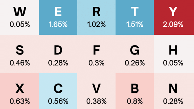
Letter frequency: language versus passwords
How does letter frequency differ between the English language more broadly and people's choices in passwords?
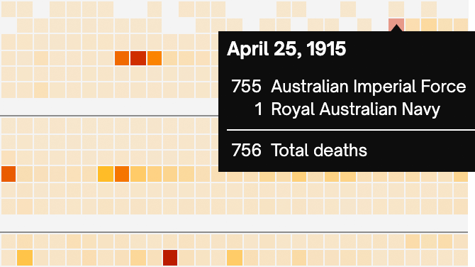
Counting the cost and the days
An analysis and visualisation of all those 102,891 service men and women commemorated on The Australian War Memorial's Roll of Honour over the 49,492 days.
Demographics of human spaceflight
A data visualisation examining the demographics of all individuals that have travelled into space including age, time in space, number of missions to space, sex and nationality.
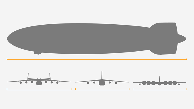
Comparison of largest aircraft
A visual comparison of the the largest aircraft by length, wingspan and maximum takeoff weight (MTOW).
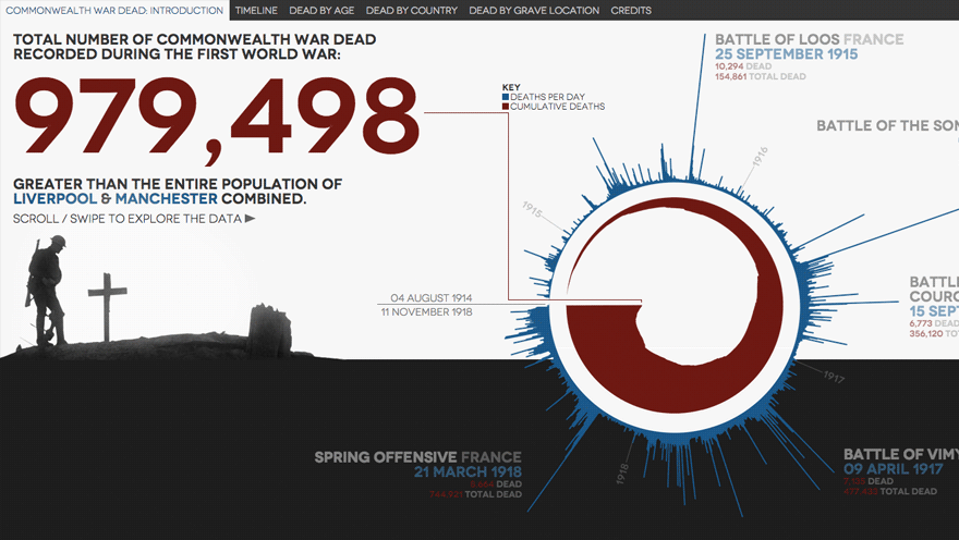
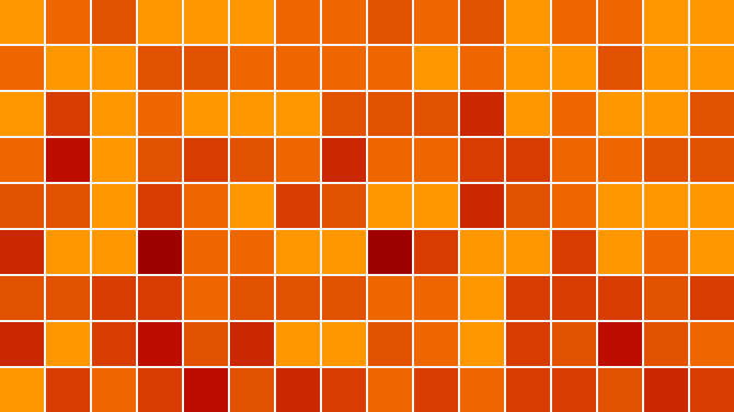
Commonwealth First World War dead visualised
A data visualisation of 979,498 recorded Commonwealth First World War war dead
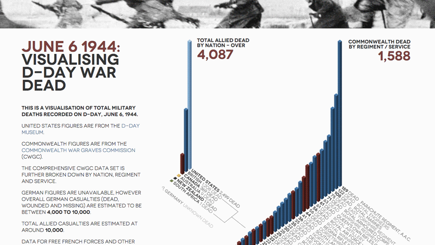
D-Day war dead visualised
A data visualisation of 4,087 Allied deaths from the D-Day landing on June 6, 1944
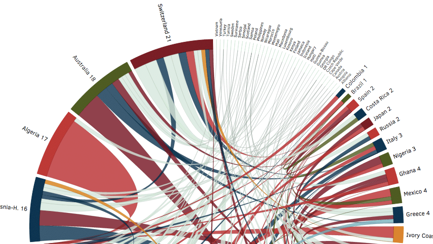
Brazil 2014: Visualising ancestral and team connections
A data visualisation of all teams and players at the Brazil 2014 World Cup showing ancestral connections between teams
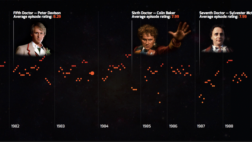
Visualising IMDb ratings of all 800 Dr Who episodes
A data visualisation of all 800 Dr Who episodes (1963 - 2013)